 |
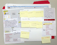
| Portal Paper Prototype |
“I really struggle navigating around the U [website] now,” said one participant. “I like this because everything is in one place.” Participants also liked having their most important tools at the top of the page, and being able to reorganize their tools.
There were criticisms, too. Early prototypes are very basic-looking, and one participant said, “this feels dry, not ‘Driven to Discover’.” The portal team is working with University Relations on getting the U’s branding and look and feel into the portal designs.
The “rapid” portion of Rapid Prototyping involved giving morning participants one version, then rebuilding it based on their feedback over lunch and giving afternoon participants a new version. The afternoon versions tested better on navigation and were praised as “personalized and efficient.”
The team will take the feedback from this usability testing to help design the “rough draft” prototypes being released in fall 2013. These internet prototypes will have an interface like the paper prototypes, except they will be displayed online with active links. However, the prototypes will not be fully functional or interact with real data. More rounds of usability testing with randomly selected participants are scheduled for this fall and winter. Visit the University’s Usability Lab website for more information on the lab and their services.
Stay tuned to the ESUP and Portal blogs -- we’ll post links to the “rough draft” prototypes when they’re available for your feedback!

No comments:
Post a Comment